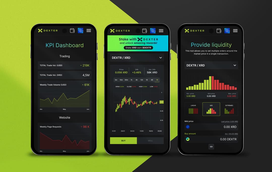
Enhancing the trading experience on Radix

35%
Faster order flow completion

50%
Fewer input errors

90%
Clearer trading dashboards
- My Role
- UX/UI designer
- Timeline
- 4 months
- My Contribution
UX/UI redesign
Community-driven design iteration
Design system
Visual Design
Overview
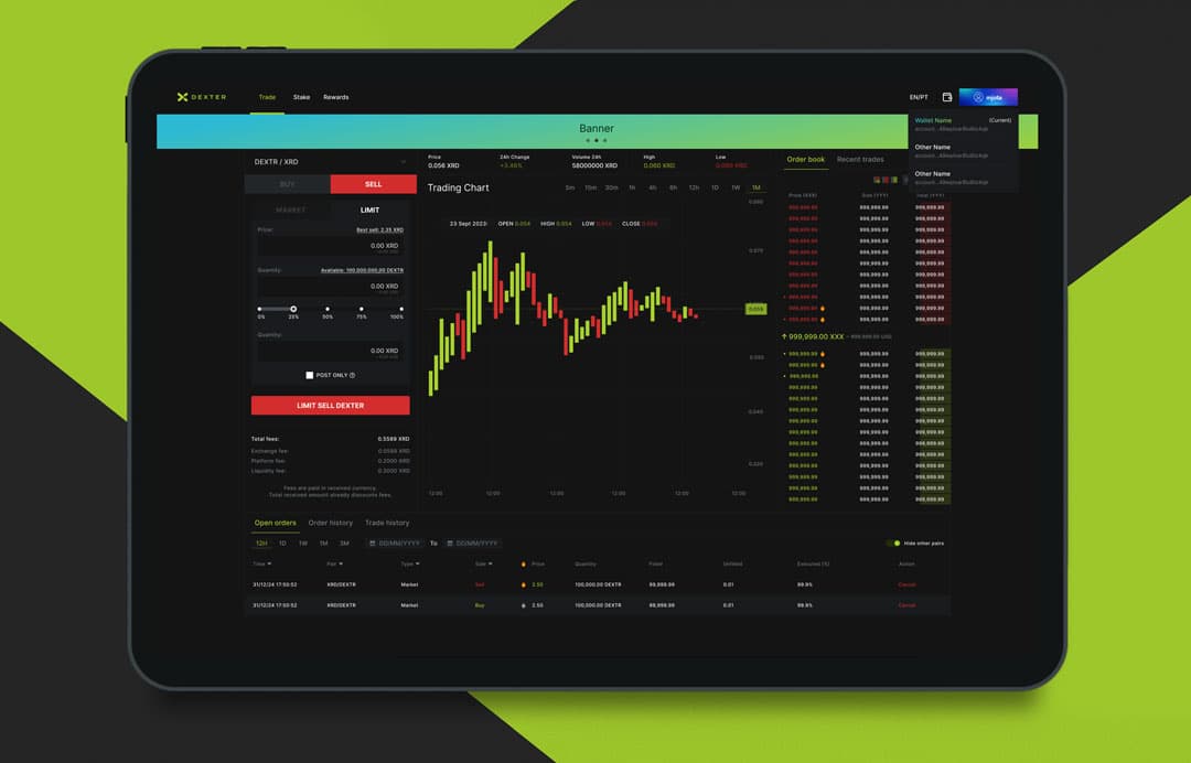
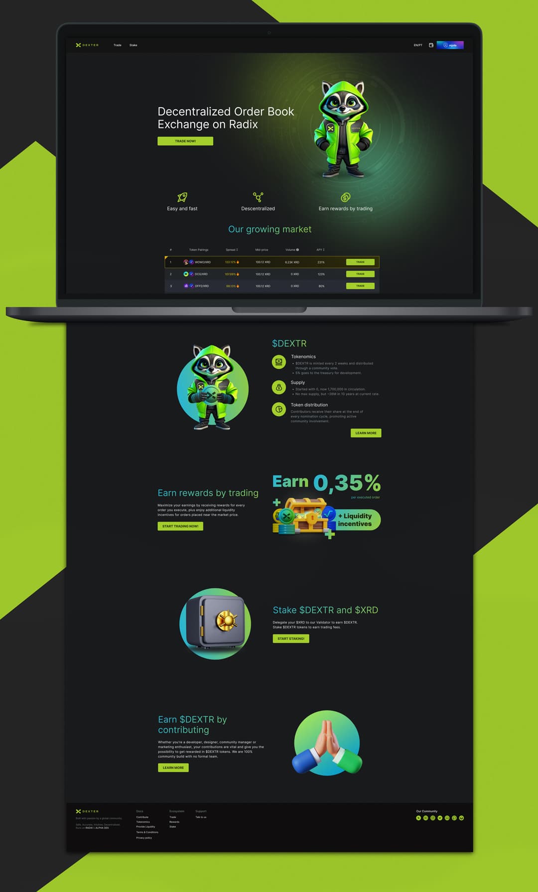
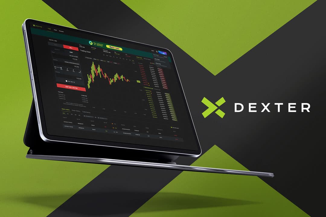
Dexter is a collaborative order book exchange built on the Radix Network. I was responsible for improving the platform’s UX/UI, leading interface redesigns, building a scalable design system, and collaborating closely with the community and developers to shape product decisions.
The Problem
Goals
- Improve trading speed and flow efficiency Success metric: reduction in the time required to create and confirm an order. - Reduce user errors during trading Success metric: reduction in input errors and manual corrections in the trading flow. - Increase clarity and confidence in the interface Success metric: increase in perceived dashboard clarity, based on user feedback. - Provide clear and immediate feedback for user actions Success metric: Lower friction and fewer abandoned or repeated actions during order execution. - Build a consistent and scalable design systemSuccess metric: Reusable components adopted across core trading features and new product areas.
Process
1. Discover Usability audit, community conversations, and user surveys to identify friction points and usability gaps in the trading experience. 2. Define Insight clustering with developers and community members to prioritize high-impact problems and opportunities. 3. Explore Wireframing and solution exploration focused on clarity, consistency, and error prevention across core trading flows. 4. Design & Systemize High-fidelity redesign of key trading components and creation of a scalable design system. 5. Validate & Iterate Continuous prototyping, community feedback, developer collaboration, and iterative improvements as new features were introduced.
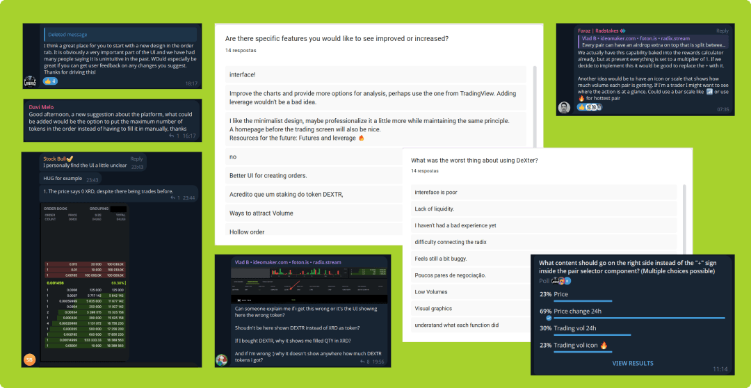
Initial design
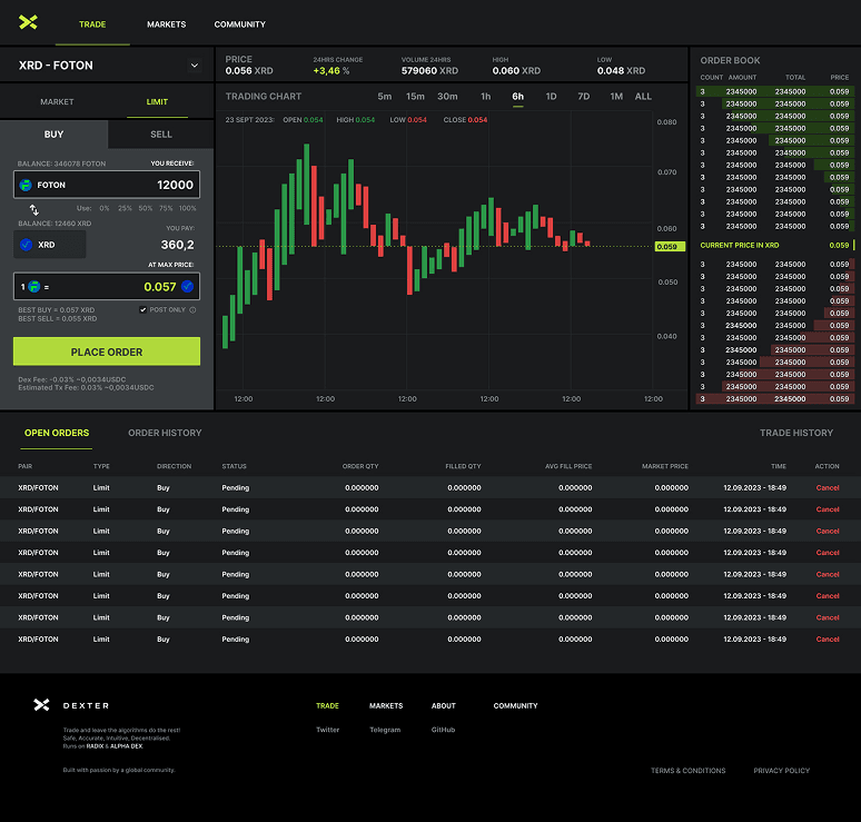
The outcome
- 35% faster order creation and confirmation, reducing friction in the trading flow. - 50% reduction in input errors and manual corrections, improving accuracy and user confidence. - 90% increase in perceived dashboard clarity, based on community user feedback. - More consistent and predictable trading experience, supported by a unified design system. - Improved collaboration between design and development, enabling faster iteration and feature delivery. - Stronger community trust and engagement, driven by transparent feedback loops and co-creation.